
Jeremy Davis
Sitecore, C# and web development
This is post 3 of 5 in a series titled Patterns for navigation controls
- Patterns for navigation controls - Basics
- Patterns for navigation controls - Breadcrumbs
- Patterns for navigation controls - Varied styles
- Patterns for navigation controls - Language versions
- Patterns for navigation controls - Language trees
Continuing the theme of simple approaches to navigation components, this week I want to look at a slightly more complex scenario for the top level navigation in a site. Sometimes you need the mark-up for primary navigation to vary between different items in your navigation. Perhaps you have some pages which need a different style of display because of their purpose on the site. And generally in this sort of scenario you need editors to have some control over which items get these different views.
 url copied!
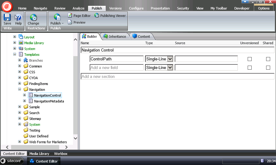
We just need the one field – "ControlPath" will hold the string path to a custom user control for rendering a customised navigation item.
Using this template we can create a shared content folder to hold our set of customised navigation options:
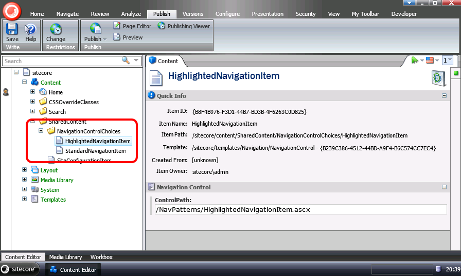
Each item created here will point to a custom UI control that we'll get to later. But with this folder defined, we can update the template for our custom navigation metadata (from the first post) to include an option for choosing which of these custom controls will be used for rendering:
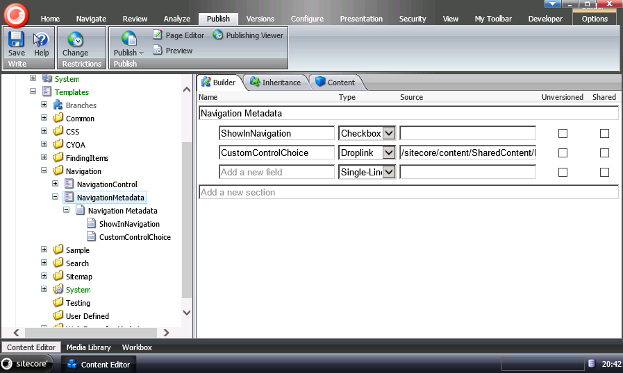
So for each page we can now make a choice of which control to display.
url copied!
public class BaseNavigationItem : System.Web.UI.UserControl
{
    public Item ContextItem { get; set; }
}
Whenever we render one of our custom bits of UI, it's going to need to know what Sitecore Item it should be doing the rendering for. With this defined, we can then create any number of custom controls. For a very basic example to act as the "default" behaviour for a navigation item we can define some markup:
<li><asp:HyperLink runat="server" ID="navLink" /></li>
And then some code behind:
public partial class StandardNavigationItem : BaseNavigationItem
{
    protected void Page_Load(object sender, EventArgs e)
    {
        navLink.Text = ContextItem.DisplayName;
        navLink.NavigateUrl = Sitecore.Links.LinkManager.GetItemUrl(ContextItem);
    }
}
This will just display a link to the item item in the same way the basic control in the original post did, but it leaves us the ability to customise things further later.
With this code in place (and code for other styles) we can set up the paths for our custom items above:
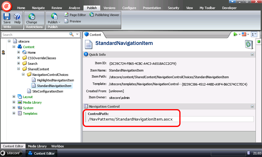
The path for our custom control is now configured to point to where the control ends up in our Sitecore deployment.
Next we need to change the way the primary navigation control processes its data. The mark-up can be simplified, because we can remove anything related to displaying the individual child items. The
<ItemTemplate>
for the inner repeater is now empty:
<asp:Repeater runat="server" ID="navRepeater">
    <HeaderTemplate><ul></HeaderTemplate>
    <ItemTemplate>
        <li>
            <asp:HyperLink runat="server" ID="navLink" />
            <asp:Repeater runat="server" ID="childRepeater">
                <HeaderTemplate><ul></HeaderTemplate>
                <ItemTemplate />
                <FooterTemplate></ul></FooterTemplate>
                </asp:Repeater>
            </asp:Repeater>
        </li>
    </ItemTemplate>
    <FooterTemplate></ul></FooterTemplate>
</asp:Repeater>
And the code needs to be updated to load the appropriate custom control for each item:
public partial class CustomPrimaryNav : System.Web.UI.UserControl
{
    private string ShowInNavigationQuery = "*[@ShowInNavigation='1']";

    protected void Page_Load(object sender, EventArgs e)
    {
        var rootItem = Sitecore.Context.Database.GetItem(Sitecore.Context.Site.ContentStartPath);
        navRepeater.DataSource = rootItem.Axes.SelectItems(ShowInNavigationQuery);
        navRepeater.ItemDataBound += navRepeater_ItemDataBound;
        navRepeater.DataBind();
    }

    private void navRepeater_ItemDataBound(object sender, RepeaterItemEventArgs e)
    {
        if (e.Item.ItemType == ListItemType.AlternatingItem || e.Item.ItemType == ListItemType.Item)
        {
            var item = e.Item.DataItem as Item;

            var navLink = e.Item.FindControl("navLink") as HyperLink;
            var childRepeater = e.Item.FindControl("childRepeater") as Repeater;

            navLink.Text = item.DisplayName;
            navLink.NavigateUrl = Sitecore.Links.LinkManager.GetItemUrl(item);

            childRepeater.DataSource = item.Axes.SelectItems(ShowInNavigationQuery);
            childRepeater.ItemDataBound += childRepeater_ItemDataBound;
            childRepeater.DataBind();
        }
    }

    private void childRepeater_ItemDataBound(object sender, RepeaterItemEventArgs e)
    {
        if (e.Item.ItemType == ListItemType.AlternatingItem || e.Item.ItemType == ListItemType.Item)
        {
            var item = e.Item.DataItem as Item;

            var ctrl = fetchCustomControl(item);

            e.Item.Controls.Add(ctrl);
        }
    }

    private Control fetchCustomControl(Item item)
    {
        string ctrlPath = "/NavPatterns/StandardNavigationItem.ascx";

        string customControlItemID = item.Fields["CustomControlChoice"].Value;
        if (!string.IsNullOrWhiteSpace(customControlItemID))
        {
            Item customControlItem = Sitecore.Context.Database.GetItem(customControlItemID);
            if( customControlItem != null)
            {
                string path = customControlItem.Fields["ControlPath"].Value;

                if(!string.IsNullOrWhiteSpace(path))
                {
                    ctrlPath = path;
                }
            }
        }

        var ctrl = this.LoadControl(ctrlPath) as BaseNavigationItem;
        ctrl.ContextItem = item;

        return ctrl;
    }
}
The key changes here are in the
childRepeater_ItemDataBound(). Rather than setting the data into the mark-up directly, the code calls
fetchCustomControl()
passing the current item to get a control back. This control is then directly added to the repeater item control tree.
The process to find the custom control in
fetchCustomControl()
is pretty simple. It looks at the "which custom control" field we defined above, gets the ID stored here and loads the target item. From this item the control path can be extracted. If any of this code fails to find a value or an item then the "default" control path is used. Finally the control path is used to load the user control, and cast it to the base type we defined above. Finally the context item is passed in to the
ContextItem
property.
With that in place, an editor can now pick the style of navigation they want presented for a given item in your site. All that remains is creating controls and data for the styles of display you want to have...
↑ Back to top
