
Jeremy Davis
Sitecore, C# and web development
My work sometimes involves picking up projects that were started by other developers / agencies and making changes or enhancements. Sometimes the approaches used by the original developers can make these enhancements harder than they need to be. The HTML, CSS and Javascript of a recent project I worked on caused some issues that I thought were worth calling out to try and help developers do better work in the future.
One of the things that's really great about Sitecore is how both developers and non-technical users can modify the layout of pages using the Presentation Details and Page Editor's design mode. Adding and removing components from placeholders, or moving components around the page can be a very powerful tool for making compelling web pages. And combining it with personalisation can enhance the power further.
But to take advantage of these Sitecore features, it's important that the markup for the components and layouts allow them to be moved about the pages while still looking good.
 url copied!
div.layout div.firstplaceholder div.titlecomponent div.heading h2 {
  margin-top: 2px;
}
and similar things were being done with jQuery selectors too:
$(document).ready(function(){
  $("div.layout div.firstplaceholder div.titlecomponent a.link").click(function(){
    // some processing
  });
});
So it's pretty obvious why this doesn't play nicely with Page Editor – as soon as you move your component from "firstplaceholder" into "secondplaceholder" the selectors all start to fail. And that means rework is required whenever an editor decides they'd like to use an existing component in a new location.
So what can be done to improve on this?
url copied!
The first thing is that I tend to write selectors for component markup relative to the component itself. If I were creating a sublayout for displaying a page titles, the selectors for CSS or jQuery will mostly be based on just the classes applied to this component. For example a title/subtitle component might generate markup and styles like:
<div class="title">
   <h1>The overall page title</h1>
   <h2>Subtitle</h2>
</div>
.title {
   margin: 5px;
}
.title h1 {
   font-size: 1.5em;
}
Wherever possible, the selectors don't refer to the container that the component is placed in. Hence the component should mostly work in any placeholder.
There will be some scenarios where the placeholder is important though. I find this is commonly important for styles relating to adjusting layout for column widths, or for spacings between lists of components. For example – something like this sort of two column layout:
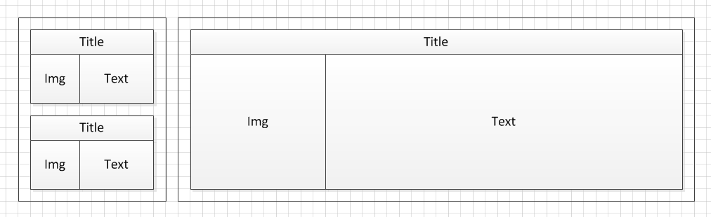
When a component needs to be moved between these two columns extra CSS can be provided that sets properties specific to these differing display styles. Those selectors can be specific to both the placeholder and the component. I tend to structure the CSS so that only the properties that are specific to the display style differences are paired with these more specific selectors. For example, if the padding changes between different columns:
.narrowPlaceholder .title {
  padding: 5px;
}
.widePlaceholder .title {
  padding: 20px;
}
It's worth noting that simpler selectors can have performance benefits too. Guides for writing high-performance CSS suggest that you should avoid excessive use of "tag.class" style selectors, as well as complex selection trees.
Also, it's worth thinking carefully about using IDs for your HTML tags, and selectors based on IDs when you're creating UI components for Sitecore. If it's possible that your component might get added to the page more than once you should avoid IDs. It's not valid markup to have the same ID on a page twice...
Sometimes you come across scenarios where you want the look and feel or behaviour of a component to be variable, but where you can't make use of a sensible CSS or Javascript selector from the basic markup or structure. For example, a "highlighted item" in a placeholder might not always be the first one displayed. It might need to be selected by an editor. The tactic I've used for this in the past is to vary the CSS classes applied to the markup using code.
You might be able to add a class by calculating something in the code-behind. This could come from a field on a context item – for example the item being displayed has a "highlighted" field for editors. This makes sense in the scenario where the data defines whether the item should receive the alternative formatting. Alternatively the data might not contain an appropriate value, or the data might not be the reason for the change of display style. In that case you might a field to a Parameter Template for the component itself to let the user select CSS classes to add to the control.
But whatever approach you use, try to think about how it might affect future uses of your component. Somewhere in the future a maintenance programmer will thank you for it...
↑ Back to top